23128 W 43rd St. Shawnee, KS 66226
913-384-0992 | info@amboxkc.com
Affordable, efficient and versatile, Flexographic (flexo) printing remains a key printing process over 130 years after its inception. It can print on a wide variety of substrates, from corrugated board to metallic surfaces. But it is perhaps best known for its use in the packaging sector.
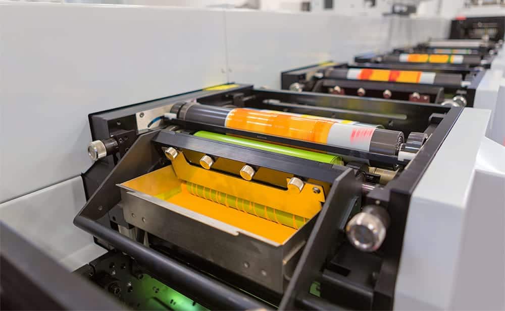
In flexo printing, water-based ink is first applied to flexible print plates. These plates then transfer the ink to the surface of the package, like a stamp. Plates are reusable, allowing for the exact same design to print across multiple packages and runs. However, every color used in a design requires its own print plate.
In digital printing, the process used by office and personal printers, color specification isn’t usually necessary. This is because these printers already have a designated set of inks, generally cyan, magenta, yellow, and black (also known as CMYK). Each color is printed as tiny dots, which when viewed together blend to form the desired colors in the document.
So why can’t flexo printing do the same thing? Technically it can. However, the smallest dot size a flexo plate can create is larger than those used in digital printing. This means that when viewed up close, the individual dots will become visible and graphics may appear pixelated. There’s also the matter of color matching, especially when printing on kraft substrates. While CMYK can approximate a wide variety of colors, it can rarely exactly match what you see on your computer screen. Colors may appear more muted or have a different tone when printed. This makes it difficult to keep important colors, such as brand colors, consistent across applications.
Lastly, there’s the cost to consider. Since flexo requires separate print plates for each color, graphics printed using CMYK would mean buying at least four separate print plates. That is a big difference in price if your package only has one or two visible colors. That’s why, except for printing color photos, it is typically cheaper and more reliable to specify ink colors to use in flexography.
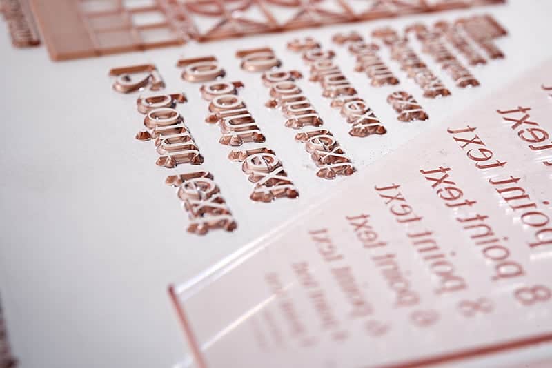
So what ink options are available in flexographic printing, and how can you communicate which ones you need? In general, there are two main ink color systems used in flexography for packaging: GCMI and Pantone (PMS) colors.
In 1949, the Glass Container Manufacturers Institute (GCMI) created the FLEXO Color Guide. This guide featured a variety of inks, numbered for easy identification and shown on both white and kraft paper. Since then, the guide has been updated multiple times as inks have been added or modified, but the general principle remains the same. The guide allows manufacturers to easily communicate ink options with clients, ensuring consistent results.
The most recent GCMI guide, edition x, has a total of 42 colors to choose from. GCMI colors are standard across corrugated packaging manufacturers. Your manufacturer should be able to provide you with color swatches of the different options on either white or kraft paper, so you can select the ones that best fit your project. There are various places online that show previews of different colors as well. But while these can be helpful for seeing the general options, you shouldn’t use them in place of physical swatches when making a final color selection
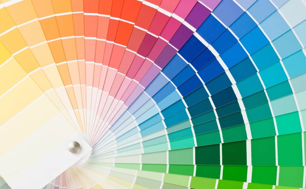
Not seeing a GCMI color that matches your vision? Many packaging manufacturers also allow you to select Pantone colors. There are a huge variety of available options, but for corrugated packaging the ones you will need are divided between coated and uncoated colors. Substrates without a coating (like kraft or mottled white) will use uncoated inks, while coated substrates (like Kemi) will use coated colors. Coated Pantone colors have a ‘C’ at the end of their code, and uncoated colors have a ‘U’, (e.g. 102 C or 102 U). Before making your selection, check with your manufacturer if your project requires coated or uncoated colors, as the same Pantone number will appear different on coated or uncoated stock.
One disadvantage of Pantone colors compared to GCMI colors is that Pantone does not provide swatches printed on kraft. So the colors you select may end up appearing warmer, darker, and more muted than expected. One option to get a more exact match is to print white ink underneath the desired color. However, this requires buying another print plate and results will still not be exact. Some Pantone colors may also cost significantly more, or your manufacturer may not carry them.
For best results, always communicate with your manufacturer what your color expectations are so they can help you find the right solution for you. Having a couple Pantone colors in mind or a printed sample to match are a great start. Some manufacturers offer custom ink mixing options, while others only offer basic GCMI colors. Depending on your needs, your manufacturer might even recommend a different printing process, such as digital print or litho labels.
At American Box, we are always happy to help you find the best colors and printing processes for your needs. Contact us today to schedule a free design consultation with one of our experienced packaging designers.